#TidyTuesday Week 50 Plot Replicas
Posted on December 12, 2019 | 5 minute readDocumenation
Plots are replicated based on Battling Infectious Diseases in the 20th Century: The Impact of Vaccines by Tynan DeBold and Dov Friedman.
You can find the graphics here: http://graphics.wsj.com/infectious-diseases-and-vaccines/?mc_cid=711ddeb86e
Load Packages
library(tidyverse)
library(highcharter)
library(extrafont)
library(widgetframe)
Load data
diseases <- read_csv("https://raw.githubusercontent.com/rfordatascience/tidytuesday/master/data/2019/2019-12-10/diseases.csv")Define Disease
the_disease <- "Measles"Transform Data
dat <- diseases %>%
  filter(disease == the_disease) %>%
  mutate(rate = round(count / (population/100000), digits = 2)) %>%
  select(state, year, rate) %>%
  mutate(rate = replace_na(rate, 0))
ggplot Example
# Create color palette from source chart for ggplot
chart.colors <- colorRampPalette(c("#e7f0fa", "#c9e2f6", "#95cbee", "#0099dc", "#4ab04a", "#ffd73e", "#eec73a", "#e29421", "#e29421", "#f05336", "#ce472e"), bias = 2.6)

dat %>%
  mutate(state = reorder(state, desc(state))) %>%
  ggplot(aes(year, state, fill = rate)) +
  geom_tile(color = "white", size = 0.35) +
  scale_x_continuous(expand = c(0,0)) +
  scale_fill_gradientn("Rate", colors = chart.colors(16), na.value = 'grey') +
  geom_vline(xintercept = 1963, col = "black") +
  theme_minimal() +
  theme(panel.grid = element_blank()) +
  coord_cartesian(clip = 'off') +
  ggtitle(the_disease) +
  ylab("") +
  xlab("") +
  theme(legend.position = "bottom", text = element_text(size = 8, family = "Arial")) +
  annotate(geom = "text", x = 1963.5, y = 52.5, label = "Vaccine introduced", size = 3, hjust = 0)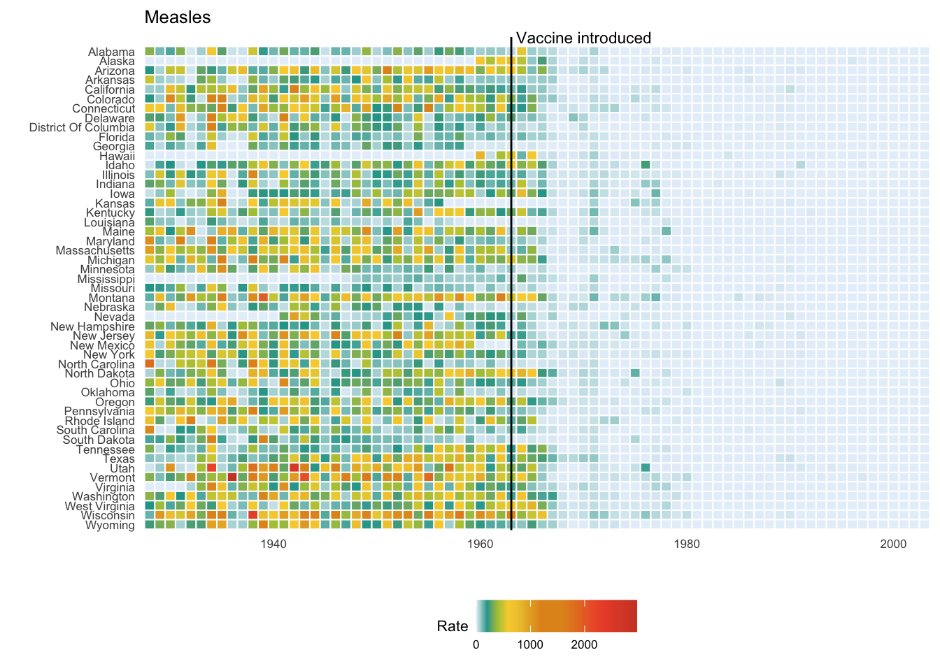
Create Color Stops
stops <- data.frame(q = c(0, 0.01, 0.02, 0.03, 0.09, 0.1, 0.15, 0.25, 0.4, 0.5, 1),
                    c = c("#e7f0fa", "#c9e2f6", "#95cbee", "#0099dc", "#4ab04a", "#ffd73e", "#eec73a", "#e29421", "#e29421", "#f05336", "#ce472e"),
                    stringsAsFactors = FALSE)
stops <- list_parse2(stops)
Create Highchart Object
highchart(height = 550) %>%
  hc_add_series(data = dat, type = "heatmap", name = "Measles Rate",
                mapping = hcaes(x = year, y = state, value = rate, name = state),
                borderColor = "white", borderWidth = 1) %>%
  hc_yAxis(reversed = TRUE,
           startOnTick = FALSE,
           categories = unique(dat$state),
           crosshair = list(zIndex = 10,
                            color = "black",
                            width = 0.5),
           labels = list(style = list(color = "#333333",
                                      fontSize = 11,
                                      fontFamily = "sans-serif",
                                      fontStyle = "normal",
                                      fontWeight = 500))) %>%
  hc_colorAxis(stops = stops) %>%
  hc_xAxis(startOnTick = FALSE,
           minPadding = 0,
           plotLines = list(list(color = "black",
                                 value = 1963,
                                 width = 2,
                                 zIndex = 5,
                                 label = list(text = "Vaccine introduced",
                                              verticalAlign = "top",
                                              textAlign = "left",
                                              rotation = 0,
                                              y = -3,
                                              style = list(color = "#333333",
                                                           fontSize = 12,
                                                           fontFamily = "sans-serif",
                                                           fontWeight = 500,
                                                           fontStyle = "normal")))),
           labels = list(style = list(color = "#333333",
                                      fontSize = 12,
                                      fontFamily = "sans-serif",
                                      fontStyle = "normal",
                                      fontWeight = 500))) %>%
  hc_tooltip(headerFormat = "<span style='font-size: 12px'>{series.name}</span><br/>",
             pointFormat = "<span style='color:{point.color}'>●</span> {point.name}: <b>{point.value}</b>",
             style = list(width = "400px",
                          fontSize = "12px",
                          fontFamily = "sans-serif",
                          fontWeight = "normal",
                          fontStyle = "normal",
                          color = "#231F20")) %>%
  hc_legend(margin = 0,
            y = 25,
            symbolHeight = 10,
            padding = 20,
            itemstyle = list(color = "#000000",
                             fontFamily = "sans-serif",
                             fontWeight = "normal",
                             fontStyle = "normal",
                             fontSize = 13)) %>%
  hc_title(text = "Measles",
           style = list(color = "#333333",
                        fontFamily = "sans-serif",
                        fontWeight = "bold",
                        fontStyle = "normal",
                        fontSize = 20),
           align = "left") %>%
  frameWidget()
Another One
# Define disease
the_disease <- "Hepatitis A"

# Transform data for chart
dat <- diseases %>%
  filter(disease == the_disease) %>%
  mutate(rate = round(count / (population/100000), digits = 2)) %>%
  select(state, year, rate) %>%
  mutate(rate = replace_na(rate, 0))

# Create highchart object
# IMPORTANT NOTE: plotLines option only accepts a list within a list
highchart(height = 550) %>%
  hc_add_series(data = dat, type = "heatmap", name = "Hepatitis A Rate",
                mapping = hcaes(x = year, y = state, value = rate, name = state),
                borderColor = "white", borderWidth = 1) %>%
  hc_yAxis(reversed = TRUE,
           startOnTick = FALSE,
           categories = unique(dat$state),
           crosshair = list(zIndex = 10,
                            color = "black",
                            width = 0.5),
           labels = list(style = list(color = "#333333",
                                      fontSize = 11,
                                      fontFamily = "sans-serif",
                                      fontStyle = "normal",
                                      fontWeight = 500))) %>%
  hc_colorAxis(stops = stops) %>%
  hc_xAxis(startOnTick = FALSE,
           minPadding = 0,
           plotLines = list(list(color = "black",
                                 value = 1995,
                                 width = 2,
                                 zIndex = 5,
                                 label = list(text = "Vaccine introduced",
                                              verticalAlign = "top",
                                              textAlign = "left",
                                              rotation = 0,
                                              y = -3,
                                              style = list(color = "#333333",
                                                           fontSize = 12,
                                                           fontFamily = "sans-serif",
                                                           fontWeight = 500,
                                                           fontStyle = "normal")))),
           labels = list(style = list(color = "#333333",
                                      fontSize = 12,
                                      fontFamily = "sans-serif",
                                      fontStyle = "normal",
                                      fontWeight = 500))) %>%
  hc_tooltip(headerFormat = "<span style='font-size: 12px'>{series.name}</span><br/>",
             pointFormat = "<span style='color:{point.color}'>●</span> {point.name}: <b>{point.value}</b>",
             style = list(width = "400px",
                          fontSize = "12px",
                          fontFamily = "sans-serif",
                          fontWeight = "normal",
                          fontStyle = "normal",
                          color = "#231F20")) %>%
  hc_legend(margin = 0,
            y = 25,
            symbolHeight = 10,
            padding = 20,
            itemstyle = list(color = "#000000",
                             fontFamily = "sans-serif",
                             fontWeight = "normal",
                             fontStyle = "normal",
                             fontSize = 13)) %>%
  hc_title(text = "Hepatitis A",
           style = list(color = "#333333",
                        fontFamily = "sans-serif",
                        fontWeight = "bold",
                        fontStyle = "normal",
                        fontSize = 20),
           align = "left") %>%
  frameWidget()
And Another One
# Define disease
the_disease <- "Polio"

# Transform data for chart
dat <- diseases %>%
  filter(disease == the_disease) %>%
  mutate(rate = round(count / (population/100000), digits = 2)) %>%
  select(state, year, rate) %>%
  mutate(rate = replace_na(rate, 0))

# Create highchart object
# IMPORTANT NOTE: plotLines option only accepts a list within a list
highchart(height = 550) %>%
  hc_add_series(data = dat, type = "heatmap", name = "Polio Rate",
                mapping = hcaes(x = year, y = state, value = rate, name = state),
                borderColor = "white", borderWidth = 1) %>%
  hc_yAxis(reversed = TRUE,
           startOnTick = FALSE,
           categories = unique(dat$state),
           crosshair = list(zIndex = 10,
                            color = "black",
                            width = 0.5),
           labels = list(style = list(color = "#333333",
                                      fontSize = 11,
                                      fontFamily = "sans-serif",
                                      fontStyle = "normal",
                                      fontWeight = 500))) %>%
  hc_colorAxis(stops = stops) %>%
  hc_xAxis(startOnTick = FALSE,
           minPadding = 0,
           plotLines = list(list(color = "black",
                                 value = 1955,
                                 width = 2,
                                 zIndex = 5,
                                 label = list(text = "Vaccine introduced",
                                              verticalAlign = "top",
                                              textAlign = "left",
                                              rotation = 0,
                                              y = -3,
                                              style = list(color = "#333333",
                                                           fontSize = 12,
                                                           fontFamily = "sans-serif",
                                                           fontWeight = 500,
                                                           fontStyle = "normal")))),
           labels = list(style = list(color = "#333333",
                                      fontSize = 12,
                                      fontFamily = "sans-serif",
                                      fontStyle = "normal",
                                      fontWeight = 500))) %>%
  hc_tooltip(headerFormat = "<span style='font-size: 12px'>{series.name}</span><br/>",
             pointFormat = "<span style='color:{point.color}'>●</span> {point.name}: <b>{point.value}</b>",
             style = list(width = "400px",
                          fontSize = "12px",
                          fontFamily = "sans-serif",
                          fontWeight = "normal",
                          fontStyle = "normal",
                          color = "#231F20")) %>%
  hc_legend(margin = 0,
            y = 25,
            symbolHeight = 10,
            padding = 20,
            itemstyle = list(color = "#000000",
                             fontFamily = "sans-serif",
                             fontWeight = "normal",
                             fontStyle = "normal",
                             fontSize = 13)) %>%
  hc_title(text = "Polio",
           style = list(color = "#333333",
                        fontFamily = "sans-serif",
                        fontWeight = "bold",
                        fontStyle = "normal",
                        fontSize = 20),
           align = "left") %>%
frameWidget()Tags:
comments powered by Disqus