Population Change
Posted on October 30, 2019 | 11 minute readIntroduction
This is the first of what I hope to be a series of demographic explorations inspired by a recent presentation from Dr. James Johnson Jr.. I had the pleasure of listening to him speak at a recent LGFCU Fellows Program alumni workshop. I’ve always been extremely interested in general demography and Dr. Johnson’s presentation inspired me to take a deeper dive into some of the topics he touched on. Dr. Johnson said that there are a lot of things we can debate but general demography is not one of them. I will hope that holds true!
First up is population change. I will start at the national level with change in raw population, work my way down to counties in North Carolina, and then finally take a look at Census Tracts in the county that I currently work for.
I will be using the Census Bureau’s American Community Survey five year estimates and pulling down data for B01001_001 - Total Population.
Load Packages
I am starting out by loading all of the packages that I plan on using. I do always like to mention that if you see something like this - scales::comma_format() - it just means that I am referencing a single function in a package instead of loading it completely. I believe the only package I am working with that way here is the scales package.
library(tidyverse)
library(tidycensus)
library(extrafont)
library(tigris)
library(usmap)
library(sf)
I am jumping right in to using the tidycensus package here but know that there is some work you need to do on the front end to be able to use it this way. You can read more about that on the tidycensus documentation site.
Universal Plot Options
Here I am setting some universal plot options for all of my plots to just get that out of the way. This eliminates the need to repetitively call this every time a create a plot. Which will be a lot!
theme_set(theme_minimal() +
            theme(text = element_text(family = "Roboto"),
                  panel.grid.major = element_line(linetype = "dotted")))
Load API Key
Now I’m loading my Census Bureau API Key from the environment variable that I’ve stored it in so I don’t have to directly share it with all of you nosey neighbors. Again, check out the documentation for the tidycensus package to learn more about this and request your own API Key from the Census Bureau here.
source("api_key/api_key.R")Now that we have all that out of the way - let’s get down to business!
USA Population Change
The first thing you will see me do here is to create a numerical vector of years from 2010 to 2017 and store it in an object named years.
Why I am doing this will hopefully make sense in the next two steps.
years <- 2010:2017Now, I will take my years object and have a little fun with the magic of the purrr package.
I am mapping my call to get_acs to each of the ACS years that I’m interested in. The ever so wonderful map_df will piece my result together as a data.frame.
country_population <- map_df(.x = years,
                             .f = ~get_acs(geography = "state", variables = "B01001_001",
                                           year = ., survey = "acs5", key = api_key))
The only thing that’s missing here is keeping track of my survey years. No worries though, purrr to the rescue once again. Here I am using the map function to apply rep_len() to each year in my years object, using flatten_chr() to format properly, creating a tibble, and then finally binding that with my country_population object.
There may be an easier way to do this but it is what makes sense to me!
country_population_updated <- map(.x = years,
                                  .f = ~rep_len(., 52)) %>%
  flatten_chr() %>%
  tibble(survey_year = .) %>%
  cbind(country_population)
To be able to look at the change in a state’s percent share of the total population of the United States, I need to compute that total for each survey year and store it in a separate object. I will be using this object in subsequent steps to compute a percent share of population for each state in each survey year.
country_totals <- country_population_updated %>%
  group_by(survey_year) %>%
  summarise(usa_total = sum(estimate)) %>%
  ungroup()
BOOM! Now I can create a final object for plotting by joining my country_total object with my country_population_updated object. As I already said, I will then compute the percent share of population for each state in each survey year.
country_pop_shares <- country_population_updated %>%
  left_join(country_totals) %>%
  mutate(pct_share = estimate/usa_total)
I want to stop here for a second and say that I won’t go through explaining this workflow for subsequent examples. I will try to be sure to draw attention to things that are different, but for the most part, each level I go down will have the same workflow that you see here.
Enough already! Let’s get down to some plotting
Raw Population Change - USA
This is just straight forward raw population change from 2010 to 2017.
country_pop_shares %>%
  select(GEOID, NAME, survey_year, estimate) %>%
  spread(key = survey_year, value = estimate) %>%
  mutate(change = `2017` - `2010`) %>%
  ggplot(aes(reorder(NAME, change), change)) +
  geom_col() +
  geom_col(aes(fill = change)) +
  coord_flip() +
  scale_y_continuous(labels = scales::comma_format()) +
  scale_fill_distiller("Raw Change", type = "div", palette = "Spectral",
                       direction = 1, labels = scales::comma_format()) +
            labs(x = NULL,
                 y = NULL,
                 caption = "\nAuthor: Jason Jones\nSource: ACS 5-Year Estimates")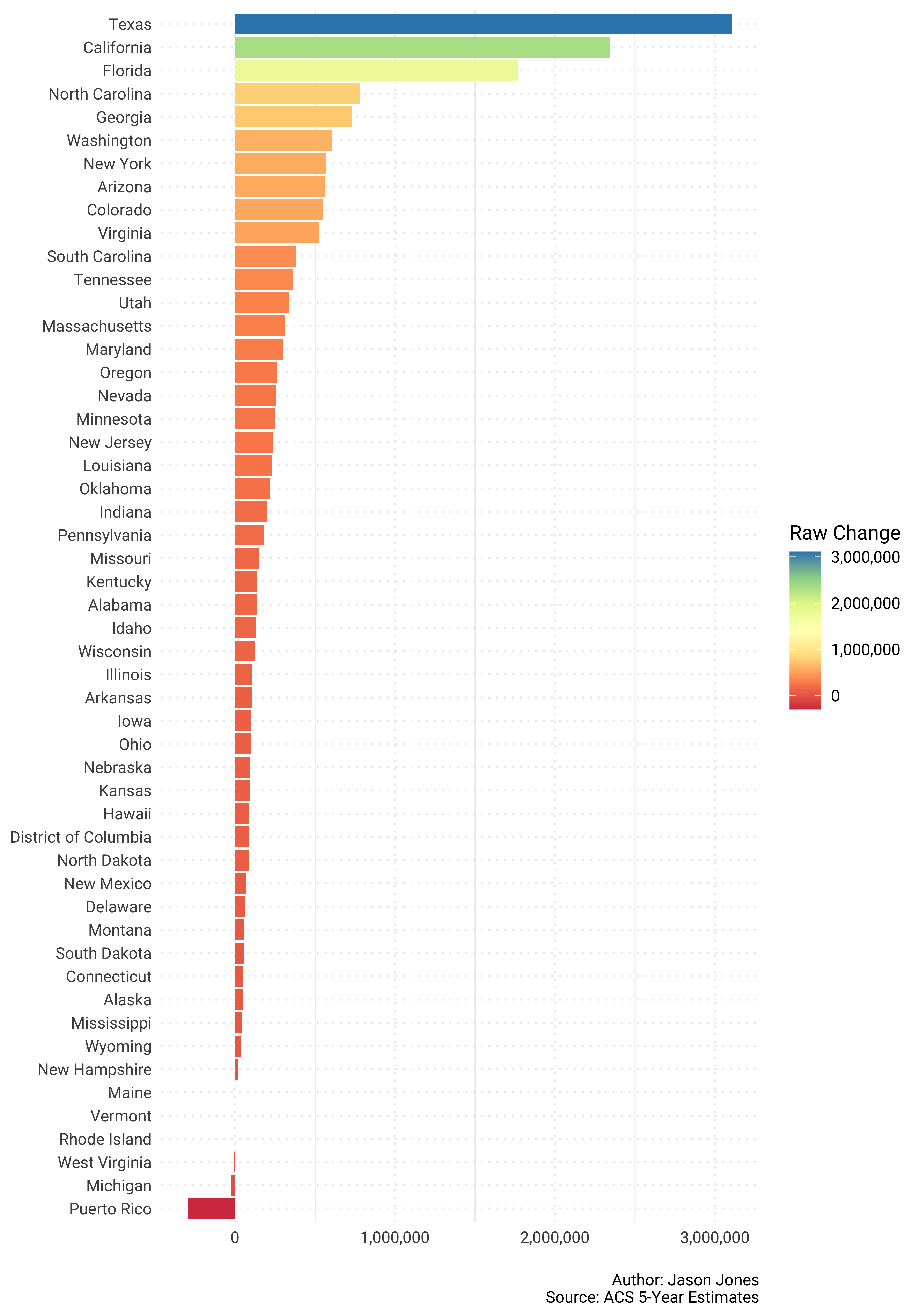
Percent Share Population Change - USA
I think this is a bit more useful. We can see, in the context of total US population, which states had a significant change in their share of that population between 2010 and 2017. Some interesting things here including North Carolina making it close to the top of the list. Definitely something to pay attention to as Dr. James Johnson pointed out!
country_pop_shares %>%
  select(GEOID, NAME, survey_year, pct_share) %>%
  spread(key = survey_year, value = pct_share) %>%
  mutate(change = `2017` - `2010`) %>%
  ggplot(aes(reorder(NAME, change), change)) +
  geom_col(aes(fill = change)) +
  coord_flip() +
  scale_y_continuous(labels = scales::percent_format()) +
  scale_fill_distiller("Change in Share", type = "div", palette = "Spectral",
                       direction = 1, labels = scales::percent_format()) +
            labs(x = NULL,
                 y = NULL,
                 caption = "\nAuthor: Jason Jones\nSource: ACS 5-Year Estimates")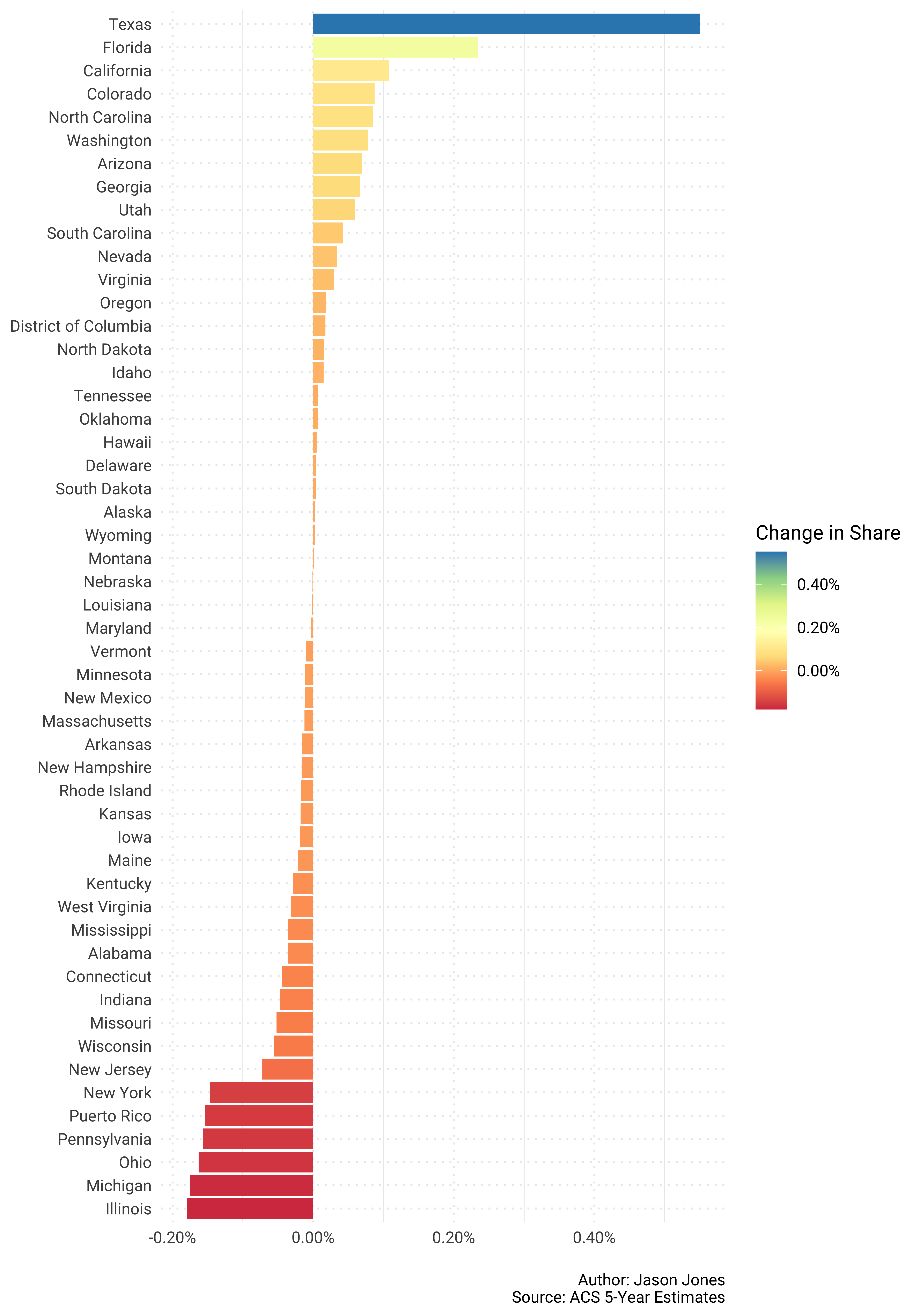
Can we take that same data and get a little spatial with it?
Of course we can! Raw change first…
for_map <- country_pop_shares %>%
  select(GEOID, NAME, survey_year, estimate) %>%
  spread(key = survey_year, value = estimate) %>%
  mutate(change = `2017` - `2010`) %>%
  rename(fips = GEOID, state = NAME)

plot_usmap(data = for_map, values = "change", color = "white") +
  scale_fill_distiller("Raw Change", type = "div", palette = "Spectral",
                       direction = 1, labels = scales::comma_format()) +
  theme(legend.position = "right") +
            labs(x = NULL,
                 y = NULL,
                 caption = "\nAuthor: Jason Jones\nSource: ACS 5-Year Estimates")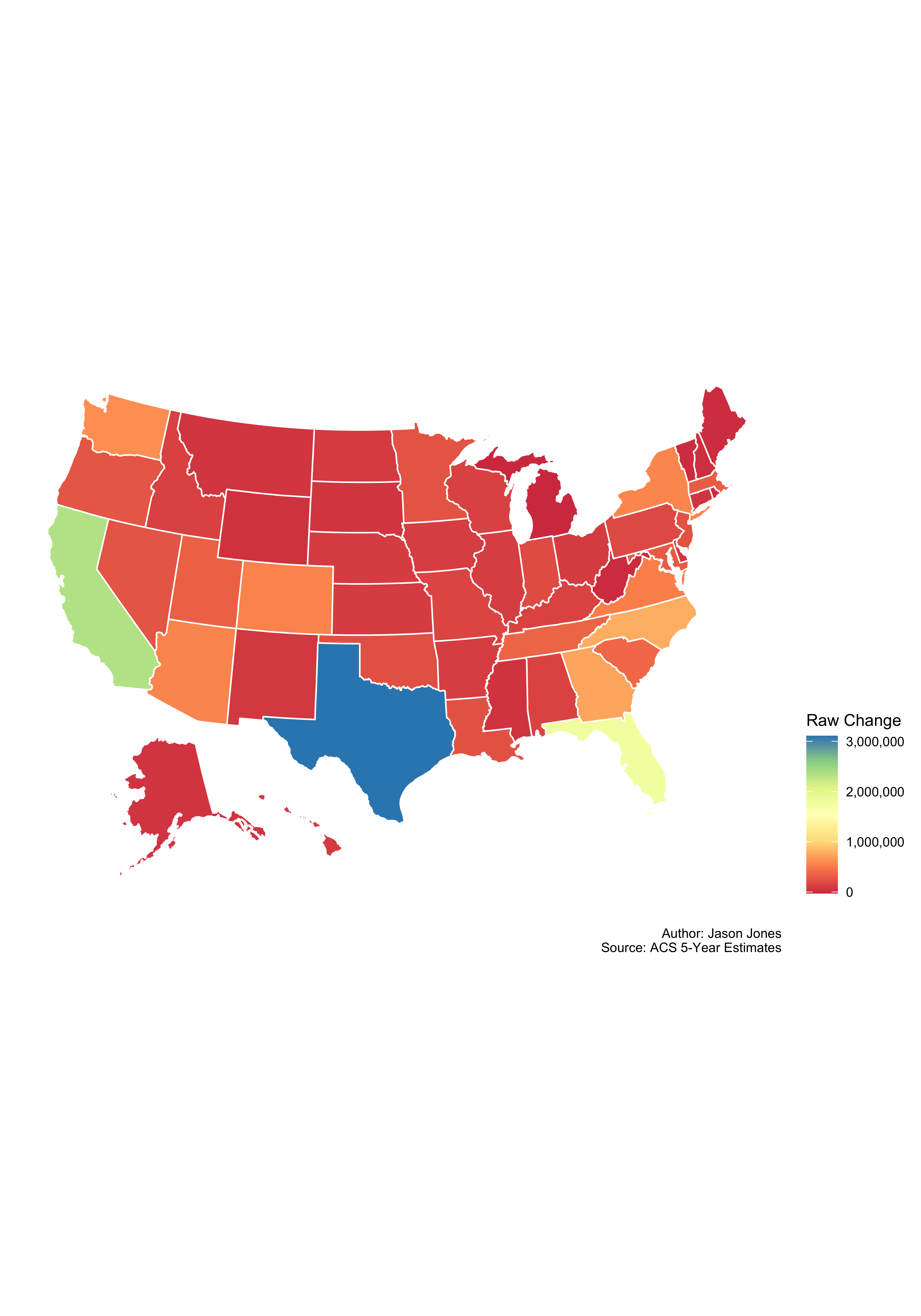
…and now change in share.
for_map <- country_pop_shares %>%
  select(GEOID, NAME, survey_year, pct_share) %>%
  spread(key = survey_year, value = pct_share) %>%
  mutate(change = `2017` - `2010`) %>%
  rename(fips = GEOID, state = NAME)

plot_usmap(data = for_map, values = "change", color = "white") +
  scale_fill_distiller("Change in Share", type = "div", palette = "Spectral",
                       direction = 1, labels = scales::percent_format()) +
  theme(legend.position = "right") +
            labs(x = NULL,
                 y = NULL,
                 caption = "\nAuthor: Jason Jones\nSource: ACS 5-Year Estimates")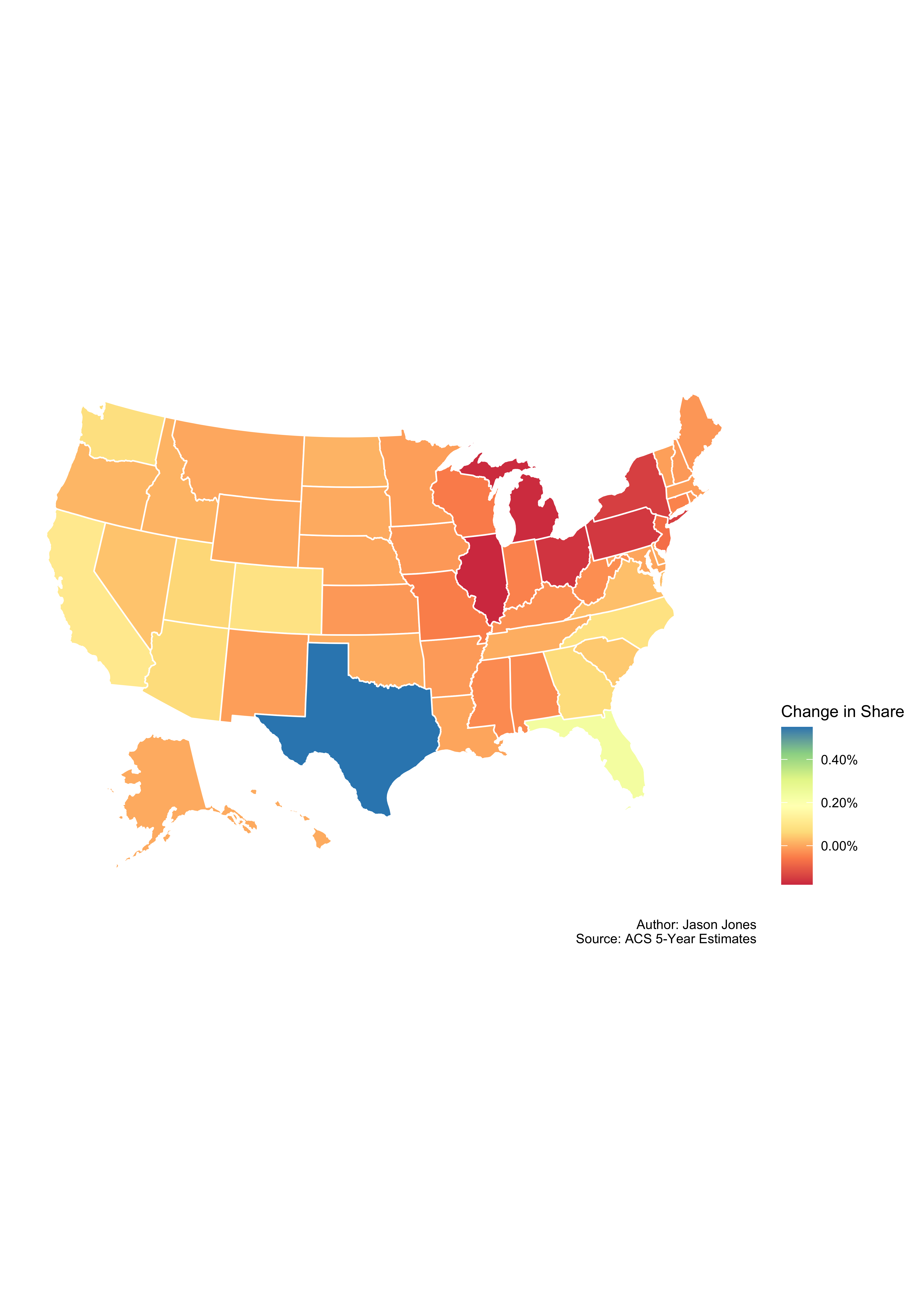
Beautiful!
NC Counties
You will notice a different step here. I am using the tigris package to create a sf object of counties in North Carolina. I created the last to plots with the usmap package but moving forward I will be using my own sf objects to merge and plot.
nc_counties_sf <- counties(state = 37) %>%
  st_as_sf()
Retrieving population again.
population <- map_df(.x = years,
                     .f = ~get_acs(geography = "county", variables = "B01001_001",
                                  year = ., state = 37, survey = "acs5", key = api_key))
Adding survey year again.
population_updated <- map(.x = years,
    .f = ~rep_len(., 100)) %>%
  flatten_chr() %>%
  tibble(survey_year = .) %>%
  cbind(population)
Computing totals again.
nc_totals <- population_updated %>%
  group_by(survey_year) %>%
  summarise(state_total = sum(estimate)) %>%
  ungroup()
Computing population shares again.
pop_shares <- population_updated %>%
  left_join(nc_totals) %>%
  mutate(pct_share = estimate/state_total)
Time to plot again!
pop_shares %>%
  select(GEOID, NAME, survey_year, estimate) %>%
  spread(key = survey_year, value = estimate) %>%
  mutate(change = `2017` - `2010`) %>%
  mutate(NAME = str_remove(NAME, "County, North Carolina")) %>%
  ggplot(aes(reorder(NAME, change), change)) +
  geom_col(aes(fill = change)) +
  coord_flip() +
  scale_y_continuous(labels = scales::comma_format()) +
  scale_fill_distiller("Raw Change", type = "div", palette = "Spectral",
                       direction = 1, labels = scales::comma_format()) +
            labs(x = NULL,
                 y = NULL,
                 caption = "\nAuthor: Jason Jones\nSource: ACS 5-Year Estimates")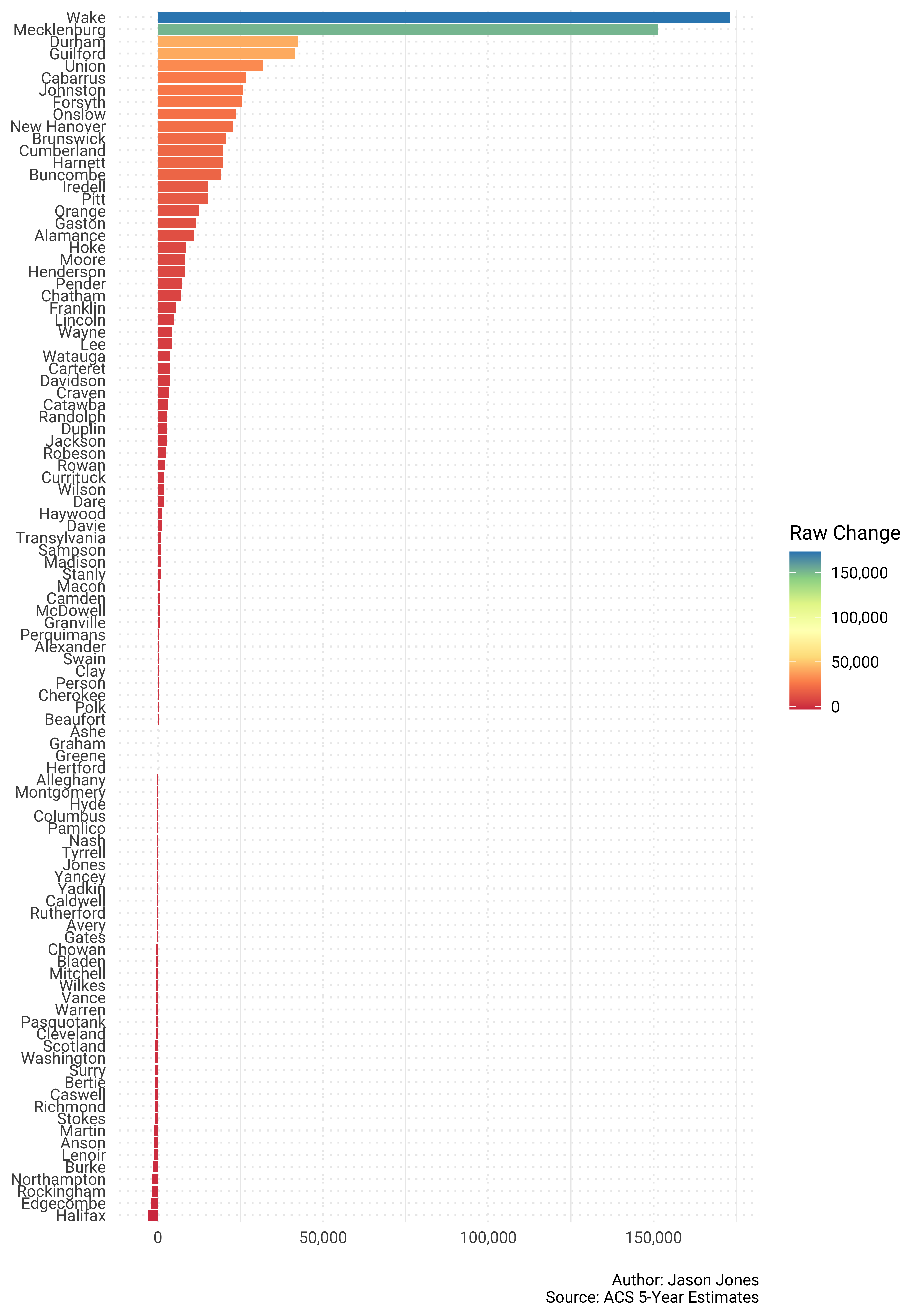
Whoa! That is a lot to digest in one plot. 100 counties makes for a lot of information. How about we just plot the top 10 and bottom 10 separately?
Here we go…First the top 10…
pop_shares %>%
  select(GEOID, NAME, survey_year, estimate) %>%
  spread(key = survey_year, value = estimate) %>%
  mutate(change = `2017` - `2010`) %>%
  mutate(NAME = str_remove(NAME, "County, North Carolina")) %>%
  top_n(10, change) %>%
  ggplot(aes(reorder(NAME, change), change)) +
  geom_col(fill = "#3288bd") +
  coord_flip() +
  scale_y_continuous(labels = scales::comma_format()) +
            labs(x = NULL,
                 y = NULL,
                 caption = "\nAuthor: Jason Jones\nSource: ACS 5-Year Estimates")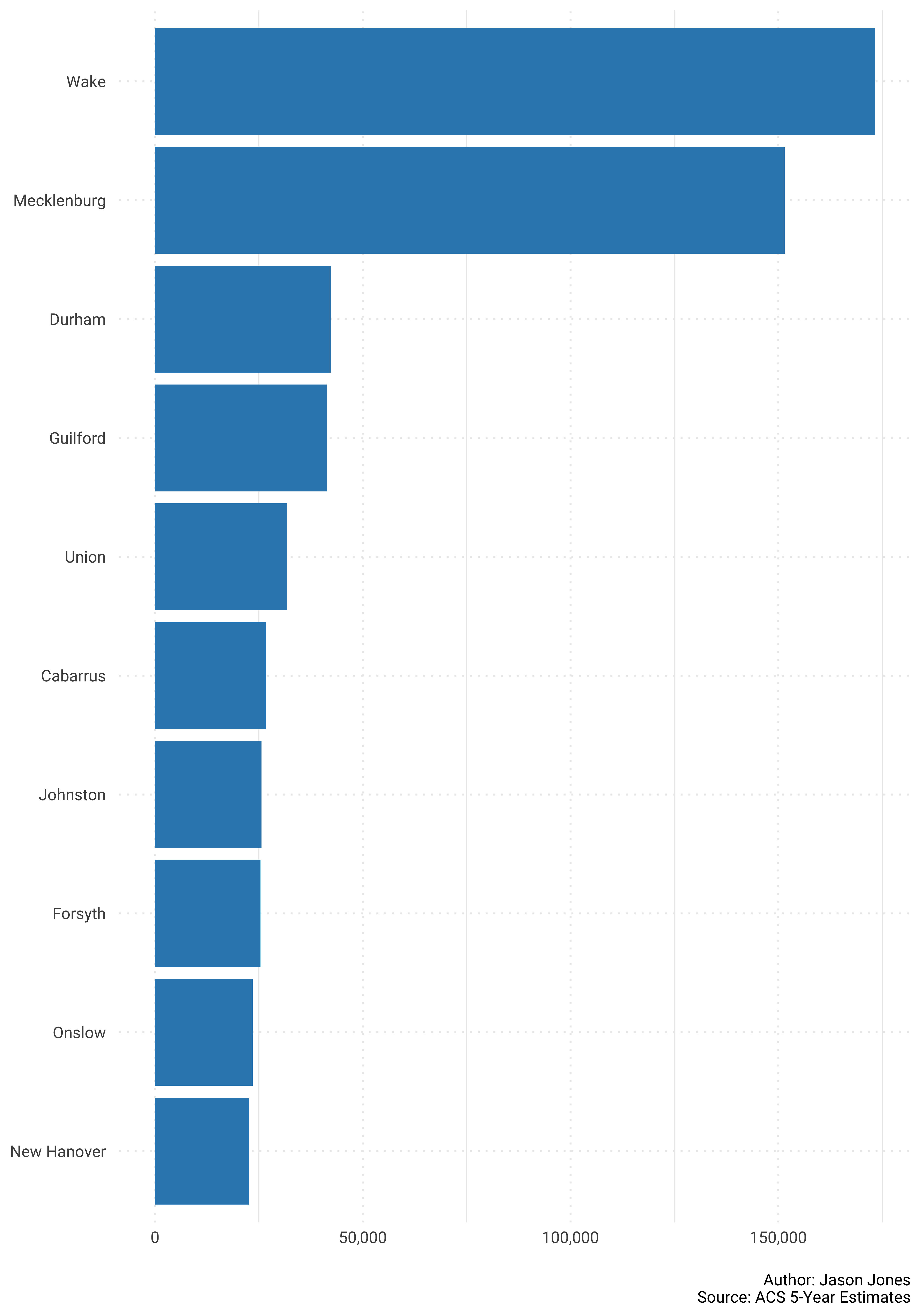
Now the bottom 10…
pop_shares %>%
  select(GEOID, NAME, survey_year, estimate) %>%
  spread(key = survey_year, value = estimate) %>%
  mutate(change = `2017` - `2010`) %>%
  mutate(NAME = str_remove(NAME, "County, North Carolina")) %>%
  top_n(-10, change) %>%
  ggplot(aes(reorder(NAME, change), change)) +
  geom_col(fill = "#9e0142") +
  coord_flip() +
  scale_y_continuous(labels = scales::comma_format()) +
            labs(x = NULL,
                 y = NULL,
                 caption = "\nAuthor: Jason Jones\nSource: ACS 5-Year Estimates")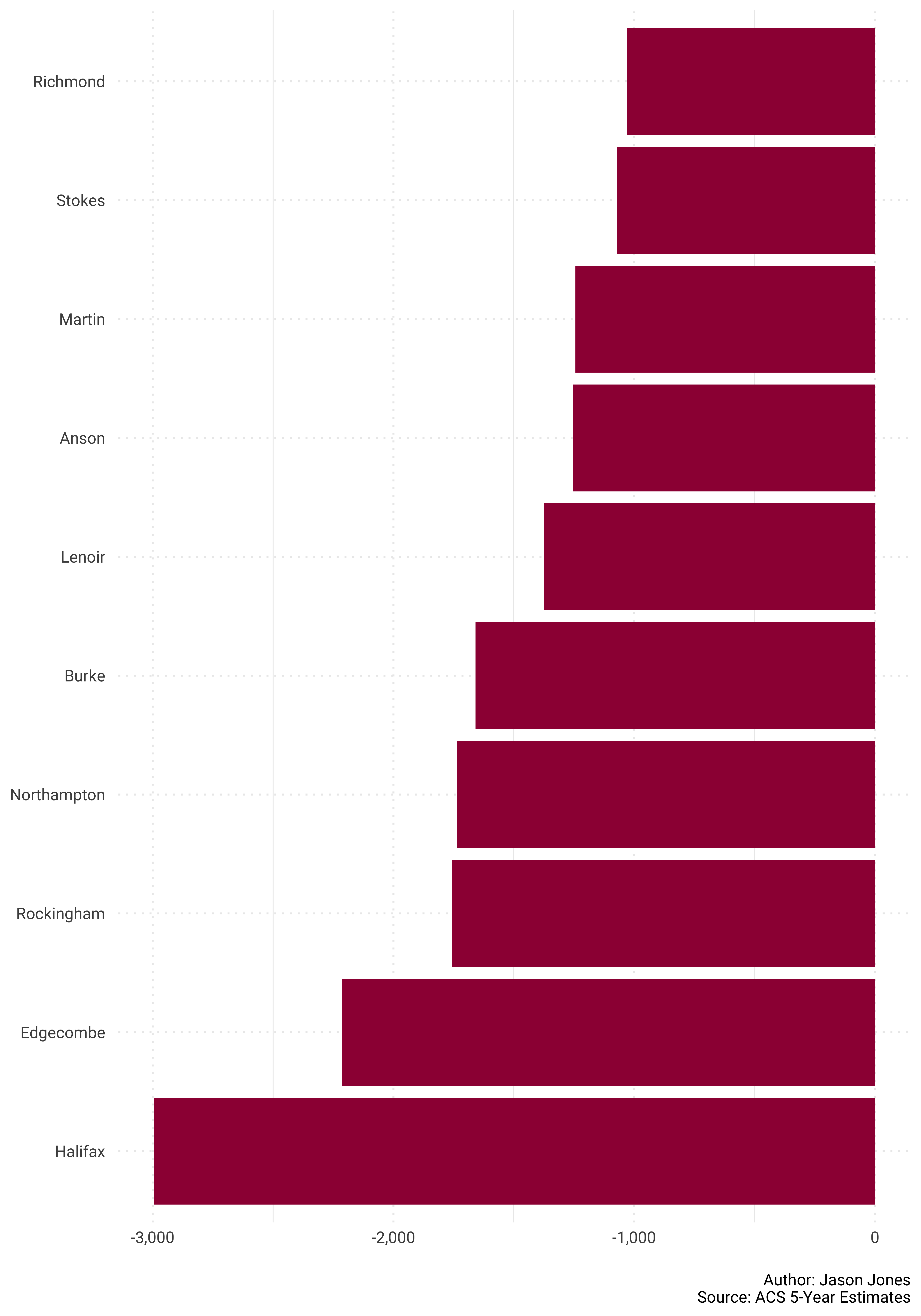
On to change in percent share of population for NC counties…
pop_shares %>%
  select(GEOID, NAME, survey_year, pct_share) %>%
  spread(key = survey_year, value = pct_share) %>%
  mutate(change = `2017` - `2010`) %>%
  mutate(NAME = str_remove(NAME, "County, North Carolina")) %>%
  ggplot(aes(reorder(NAME, change), change)) +
  geom_col(aes(fill = change)) +
  coord_flip() +
  scale_y_continuous(labels = scales::percent_format()) +
  scale_fill_distiller("Change in Share", type = "div", palette = "Spectral",
                       direction = 1, labels = scales::percent_format()) +
            labs(x = NULL,
                 y = NULL,
                 caption = "\nAuthor: Jason Jones\nSource: ACS 5-Year Estimates")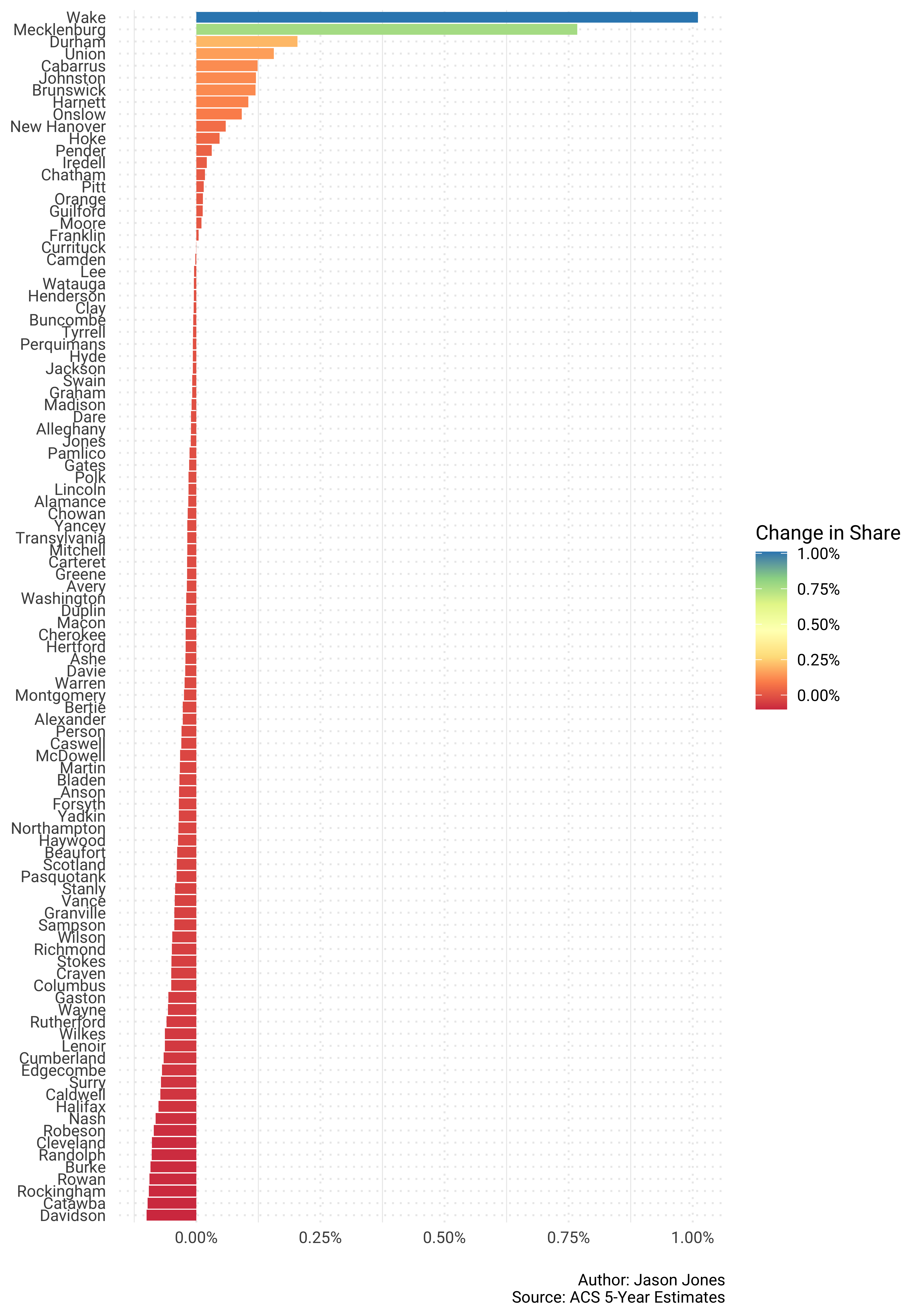
Once again, that is a lot to digest. I do like this visual though because you can quickly see that substantial population growth was limited.
Let’s do top and bottom 10 again.
Top 10 first…
pop_shares %>%
  select(GEOID, NAME, survey_year, pct_share) %>%
  spread(key = survey_year, value = pct_share) %>%
  mutate(change = `2017` - `2010`) %>%
  mutate(NAME = str_remove(NAME, "County, North Carolina")) %>%
  top_n(10, change) %>%
  ggplot(aes(reorder(NAME, change), change)) +
  geom_col(fill = "#3288bd") +
  coord_flip() +
  scale_y_continuous(labels = scales::percent_format()) +
            labs(x = NULL,
                 y = NULL,
                 caption = "\nAuthor: Jason Jones\nSource: ACS 5-Year Estimates")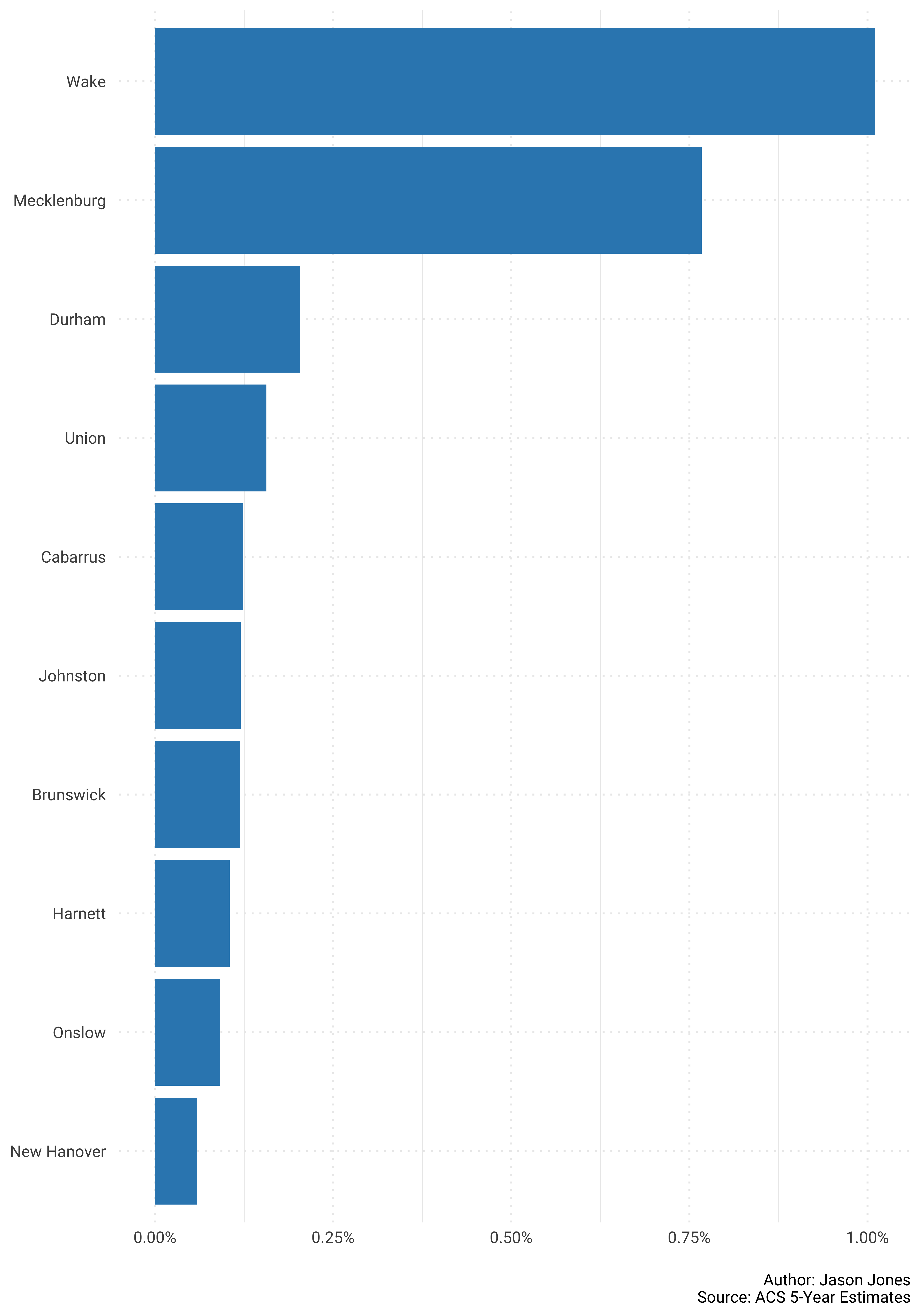
And now bottom 10 again…
pop_shares %>%
  select(GEOID, NAME, survey_year, pct_share) %>%
  spread(key = survey_year, value = pct_share) %>%
  mutate(change = `2017` - `2010`) %>%
  mutate(NAME = str_remove(NAME, "County, North Carolina")) %>%
  top_n(-10, change) %>%
  ggplot(aes(reorder(NAME, change), change)) +
  geom_col(fill = "#9e0142") +
  coord_flip() +
  scale_y_continuous(labels = scales::percent_format()) +
            labs(x = NULL,
                 y = NULL,
                 caption = "\nAuthor: Jason Jones\nSource: ACS 5-Year Estimates")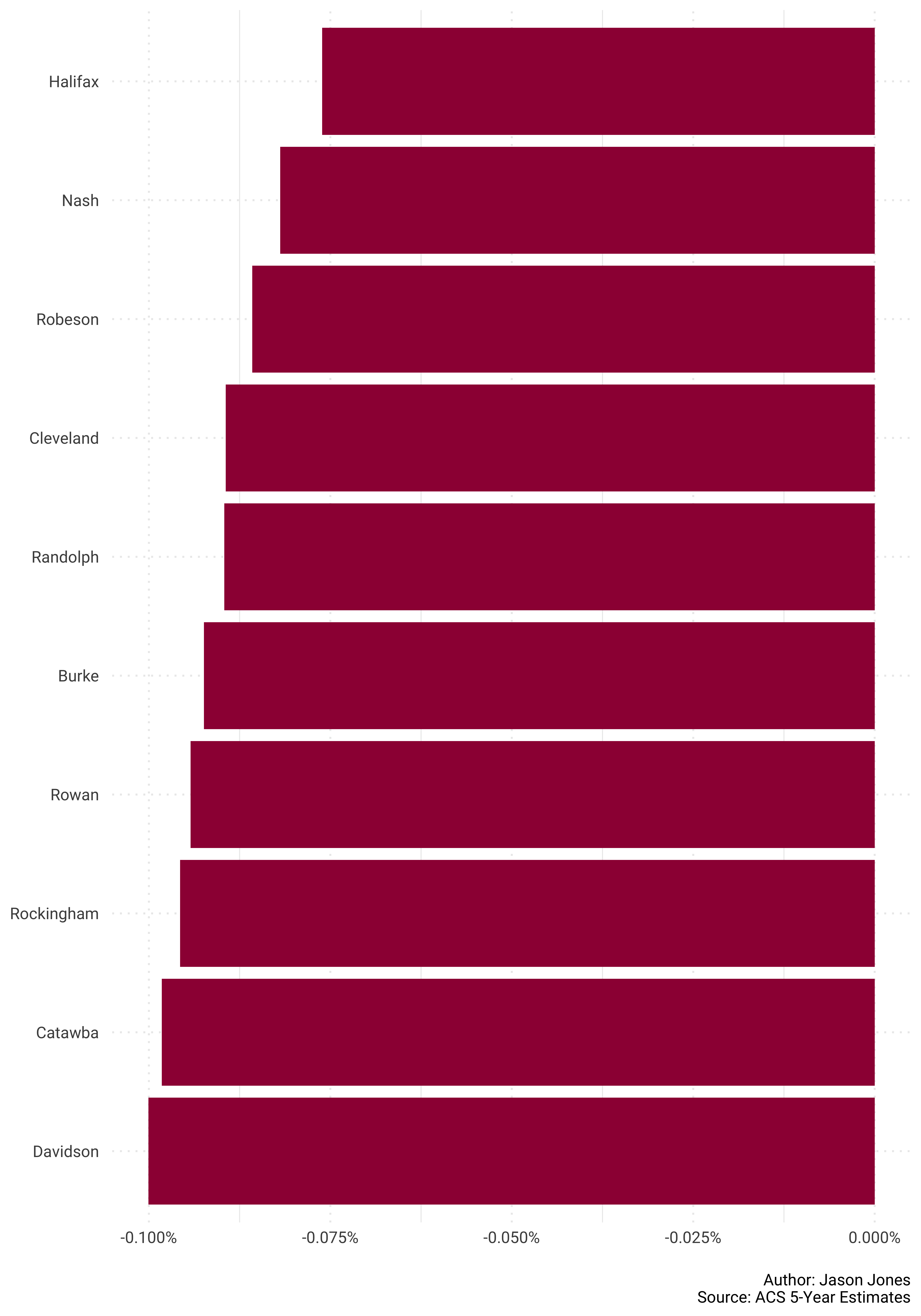
How about we take our NC counties data and get spatial again?
Let’s do it!
Raw population change across North Carolina first!
pop_shares %>%
  select(GEOID, NAME, survey_year, estimate) %>%
  spread(key = survey_year, value = estimate) %>%
  mutate(change = `2017` - `2010`) %>%
  mutate(NAME = str_remove(NAME, "County, North Carolina")) %>%
  left_join(nc_counties_sf, by = c("GEOID" = "GEOID")) %>%
  st_as_sf() %>%
  ggplot() +
  geom_sf(aes(fill = change), color = "white") +
  scale_fill_distiller("Raw Change", type = "div", palette = "Spectral",
                       direction = 1, labels = scales::comma_format()) +
            labs(x = NULL,
                 y = NULL,
                 caption = "\nAuthor: Jason Jones\nSource: ACS 5-Year Estimates")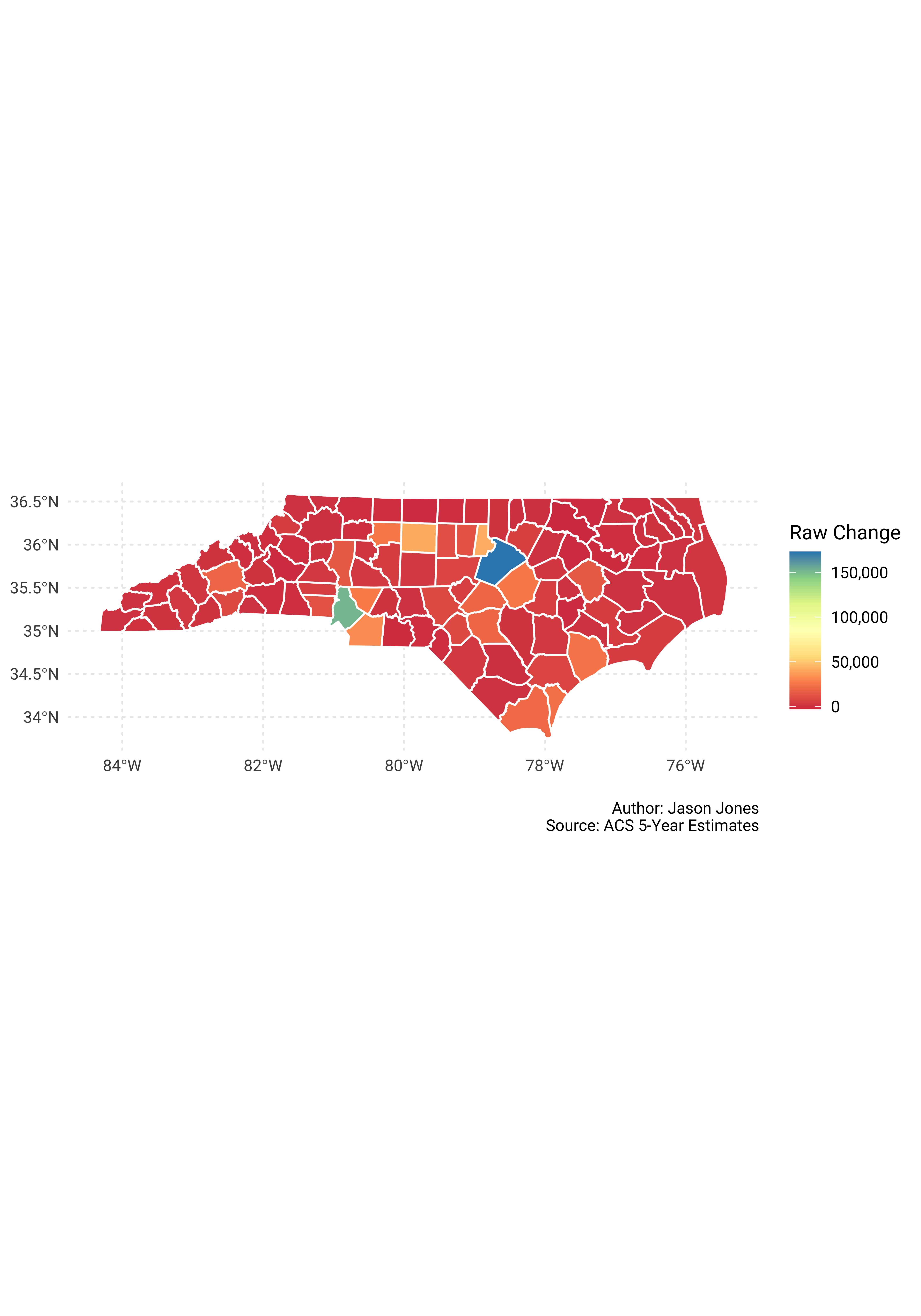
Now percent change in population share.
pop_shares %>%
  select(GEOID, NAME, survey_year, pct_share) %>%
  spread(key = survey_year, value = pct_share) %>%
  mutate(change = `2017` - `2010`) %>%
  mutate(NAME = str_remove(NAME, "County, North Carolina")) %>%
  left_join(nc_counties_sf, by = c("GEOID" = "GEOID")) %>%
  st_as_sf() %>%
  ggplot() +
  geom_sf(aes(fill = change), color = "white") +
  scale_fill_distiller("Change in Share", type = "div", palette = "Spectral",
                       direction = 1, labels = scales::percent_format()) +
            labs(x = NULL,
                 y = NULL,
                 caption = "\nAuthor: Jason Jones\nSource: ACS 5-Year Estimates")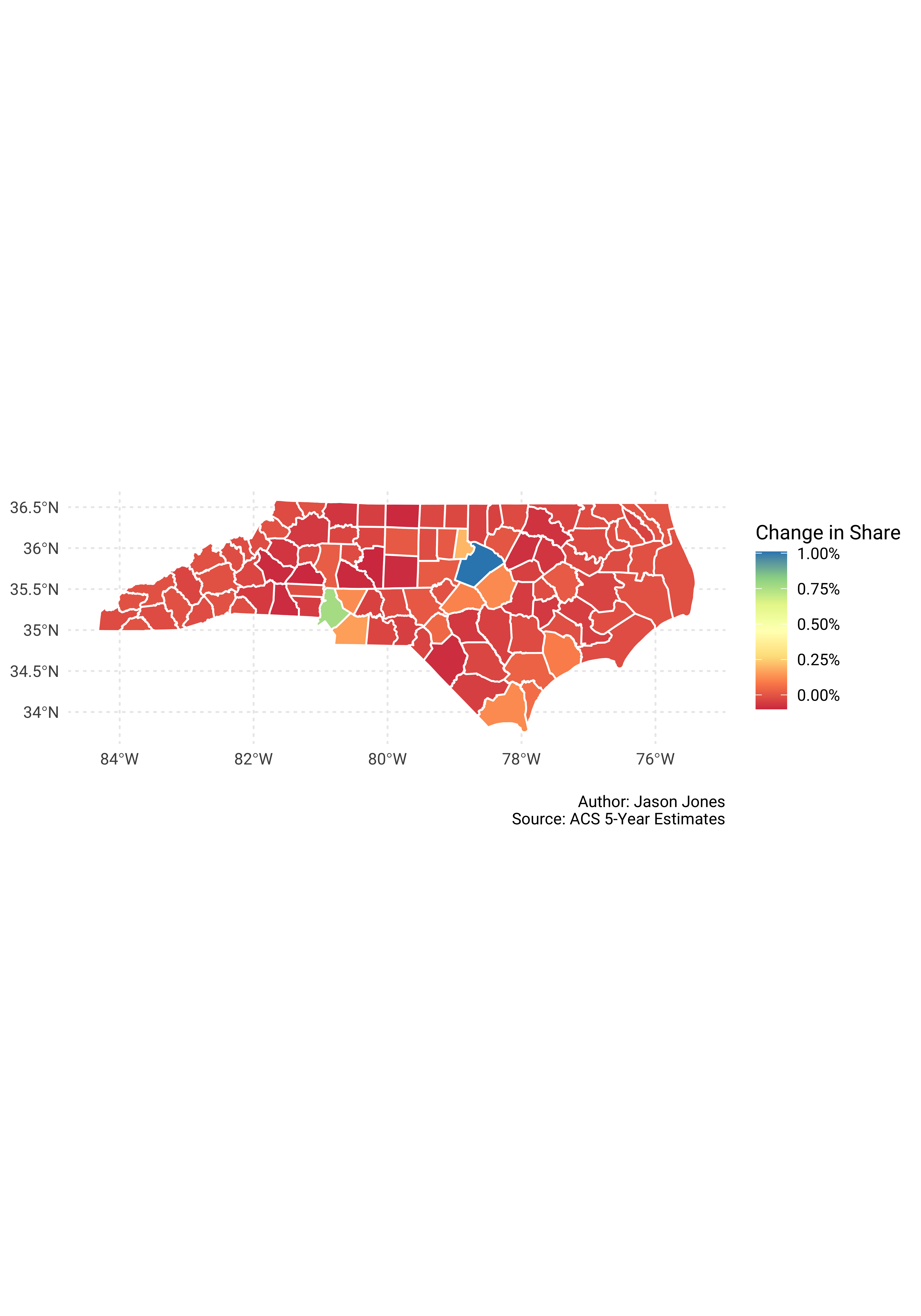
Guilford Tracts
I am using the tigris package again to create a sf object of tracts in Guilford County. I am using the same workflow again so I will spare you all of my walkthrough text.
Let’s get going..
population_tracts <- map_df(.x = years,
                            .f = ~get_acs(geography = "tract", variables = "B01001_001",
                                  year = ., state = 37, county = 81, key = api_key))
population_tracts_updated <- map(.x = years,
.f = ~rep_len(., 119)) %>%
flatten_chr() %>%
tibble(survey_year = .) %>%
cbind(population_tracts)tracts_sf <- tracts(state = 37, county = 81) %>%
st_as_sf()guil_totals <- population_tracts_updated %>%
group_by(survey_year) %>%
summarise(county_total = sum(estimate)) %>%
ungroup()guil_pop_shares <- population_tracts_updated %>%
left_join(guil_totals) %>%
mutate(pct_share = estimate/county_total)Time to plot again!
Raw change first.
guil_pop_shares %>%
  select(GEOID, NAME, survey_year, estimate) %>%
  spread(key = survey_year, value = estimate) %>%
  mutate(change = `2017` - `2010`) %>%
  mutate(NAME = str_remove(NAME, "County, North Carolina")) %>%
  left_join(tracts_sf, by = c("GEOID" = "GEOID")) %>%
  st_as_sf() %>%
  ggplot() +
  geom_sf(aes(fill = change), color = "white") +
  scale_fill_distiller("Raw Change", type = "div", palette = "Spectral",
                       direction = 1, labels = scales::comma_format()) +
            labs(x = NULL,
                 y = NULL,
                 caption = "\nAuthor: Jason Jones\nSource: ACS 5-Year Estimates")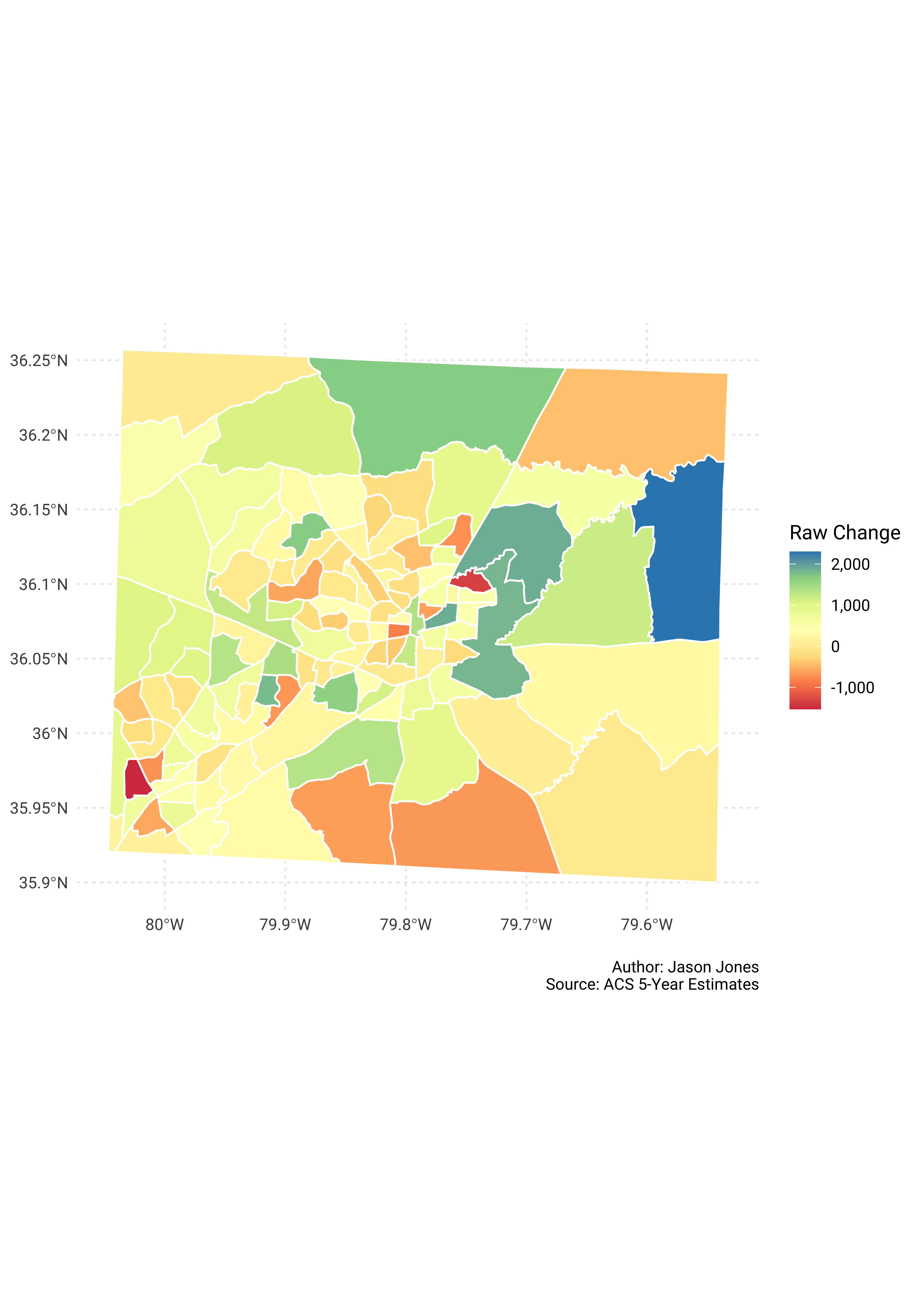
Now percent change in population share.
guil_pop_shares %>%
  select(GEOID, NAME, survey_year, pct_share) %>%
  spread(key = survey_year, value = pct_share) %>%
  mutate(change = `2017` - `2010`) %>%
  mutate(NAME = str_remove(NAME, "County, North Carolina")) %>%
  left_join(tracts_sf, by = c("GEOID" = "GEOID")) %>%
  st_as_sf() %>%
  ggplot() +
  geom_sf(aes(fill = change), color = "white") +
  scale_fill_distiller("Change in Share", type = "div", palette = "Spectral",
                       direction = 1, labels = scales::percent_format()) +
            labs(x = NULL,
                 y = NULL,
                 caption = "\nAuthor: Jason Jones\nSource: ACS 5-Year Estimates")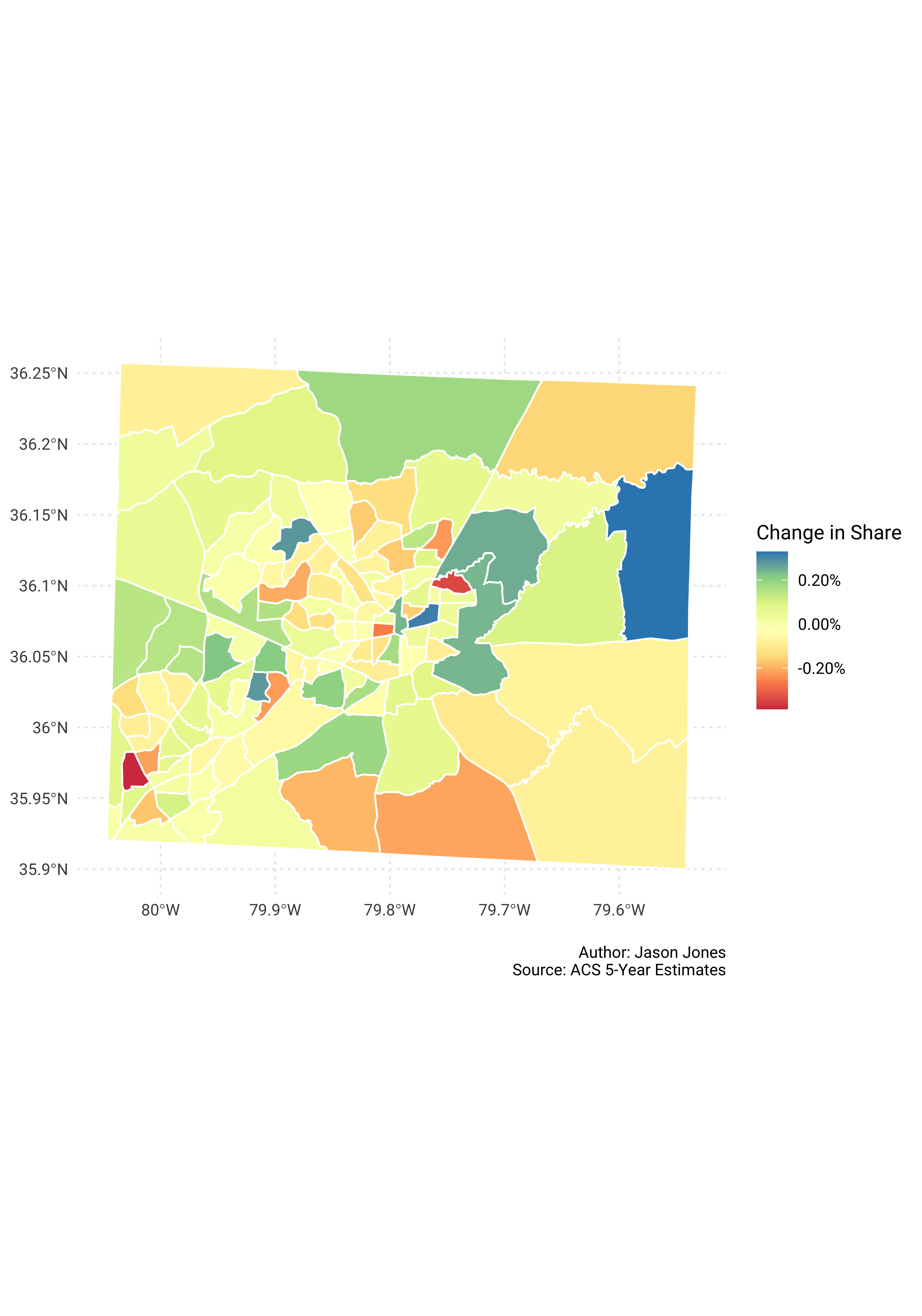
Whew! That’s all for now. Until next time…
Tags:
comments powered by Disqus