Spatial Exploration - MUSA Masterclass
Posted on November 18, 2018 | 6 minute readThis post was inspired by the MUSA Masterclass provided very graciously by Ken Steif and James Cheshire. If you aren’t familiar with the program I would strongly encourage you to check it out - UPenn MUSA Program.
I decided to use open data from the City of Raleigh for my exploration. All data can be found on The City of Raleigh’s open data portal. The primary data I am using is contained in the Raleigh Police Incidents (NIBRS) dataset. Each row represents a report made by a police officer.
Load Required Packages
Trying to keep it as simple as possible while leveraging some tidyverse tricks I’ve been trying to learn. Forcing myself to use them seems to be a good idea.
library(sf)
library(tidyverse)
library(RANN2)
Retrieve Data
Would strongly recommend downloading this data and reading from your computer. Here I am reading the data directly from the GeoJSON API endpoints.
raleigh_police <- read_sf("https://opendata.arcgis.com/datasets/24c0b37fa9bb4e16ba8bcaa7e806c615_0.geojson")

wake_police_dpts <- read_sf("https://opendata.arcgis.com/datasets/23094dc3a7b84682898c0a2c27290066_0.geojson")

raleigh_limits <- read_sf("https://opendata.arcgis.com/datasets/4303065aa95441308cc7224cf6246782_0.geojson") %>%
  filter(LONG_NAME == "RALEIGH")
Filter Missing Data
To prevent some problems down the road, I am filtering out all incidents that are missing spatial attributes.
raleigh_police <- raleigh_police %>%
  filter(is.na(latitude) != TRUE)
Test Plots
Just throwing out some quick test plots to make sure everything is working as anticipated.
plot(raleigh_police$geometry, col = "grey")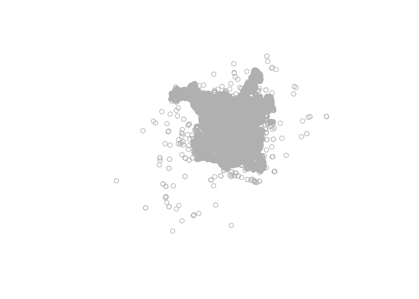
plot(wake_police_dpts$geometry, col = "grey")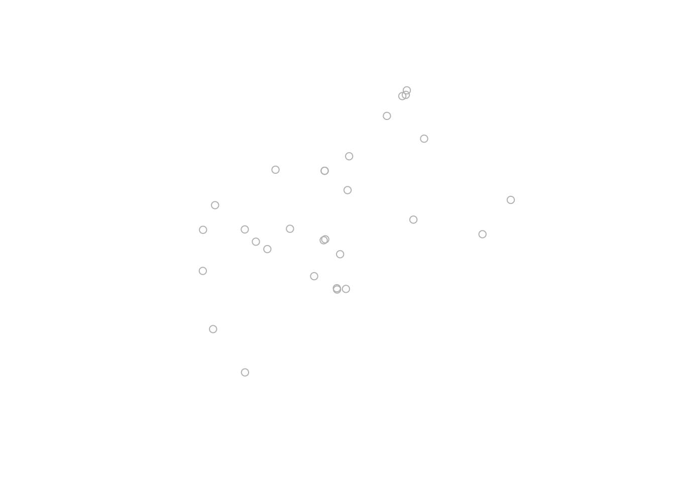
Check for matching projection
Checking for matching projections for plotting and k nearest neighbor clustering.
st_crs(raleigh_police)## Coordinate Reference System:
## User input: 4326
## wkt:
## GEOGCS["WGS 84",
## DATUM["WGS_1984",
## SPHEROID["WGS 84",6378137,298.257223563,
## AUTHORITY["EPSG","7030"]],
## AUTHORITY["EPSG","6326"]],
## PRIMEM["Greenwich",0,
## AUTHORITY["EPSG","8901"]],
## UNIT["degree",0.0174532925199433,
## AUTHORITY["EPSG","9122"]],
## AUTHORITY["EPSG","4326"]]st_crs(wake_police_dpts)## Coordinate Reference System:
## User input: 4326
## wkt:
## GEOGCS["WGS 84",
## DATUM["WGS_1984",
## SPHEROID["WGS 84",6378137,298.257223563,
## AUTHORITY["EPSG","7030"]],
## AUTHORITY["EPSG","6326"]],
## PRIMEM["Greenwich",0,
## AUTHORITY["EPSG","8901"]],
## UNIT["degree",0.0174532925199433,
## AUTHORITY["EPSG","9122"]],
## AUTHORITY["EPSG","4326"]]Create Nested Tibble
Here I am nesting the data by crime description so I can apply the clustering function. This creates a column of tibbles for each crime description which will become important as we try to distinguish densities in later steps.
raleigh_police_nested <- raleigh_police %>%
  group_by(crime_description) %>%
  nest()
Create Clustering Function
Next, I wrote a function to apply to my column of tibbles. I am using the nn2 function from the RANN2 package to perform k nearest neighbor clustering. This function clusters points by law enforcement stations.
f <- function(dat) {
  nn2(st_coordinates(wake_police_dpts), st_coordinates(dat), k =1) %>%
    data.frame() %>%
    as_tibble() %>%
    group_by(nn.idx) %>%
    summarise(cnt = n()) %>%
    right_join(wake_police_dpts, by = c("nn.idx" = "OBJECTID")) %>%
    select(-nn.idx) %>%
    filter(is.na(cnt) != TRUE)
}
Map Clustering Function to Tibble
Next, I leverage the purrr package to map the function to the column of tibbles to create a new column of tibbles containing counts by law enforcement stations.
raleigh_police_nested <- raleigh_police_nested %>%
  mutate(closest = purrr::map(.x = data, .f = ~f(.x)))
Define Crime Description
Now we are ready to explore the results. The thought here is potentially a shiny application where you could specify a crime description and produce a series of informative plots. I start by defining a new object, crime_des, to filter for only Traffic/DWI Incidents.
crime_des <- "Traffic/DWI (Driving While Impaired)"Extract Nested Tibble
Here, I am creating two new objects for plotting based on the crime description I just specified.
dat <- raleigh_police_nested %>%
  filter(crime_description == crime_des) %>%
  .$closest %>%
  .[[1]] %>%
  st_as_sf()

# Also creating secondary object for density plots
dat2 <- raleigh_police %>%
  filter(crime_description == crime_des) %>%
  st_coordinates() %>%
  as_tibble()
Density Plot
Now for the fun! First is a density map of Traffic/DWI incidents.
dat2 %>%
  ggplot() +
  geom_sf(data = raleigh_limits, color = "grey", fill = NA) +
  stat_density_2d(aes(X, Y, fill = ..level..), geom = "polygon", alpha = 0.6) +
  viridis::scale_fill_viridis(option = "magma", direction = -1, name = "Density") +
  labs(title = sprintf("Density of %s Incidents in Raleigh, NC", crime_des),
       caption = "Author: Jason Jones \nSource: http://data-ral.opendata.arcgis.com/") +
  theme(text = element_text(family = "Roboto"),
        plot.title = element_text(size = 14),
        panel.background = element_blank(),
        axis.text = element_blank(),
        axis.title = element_blank(),
        axis.ticks = element_blank(),
        axis.line = element_blank())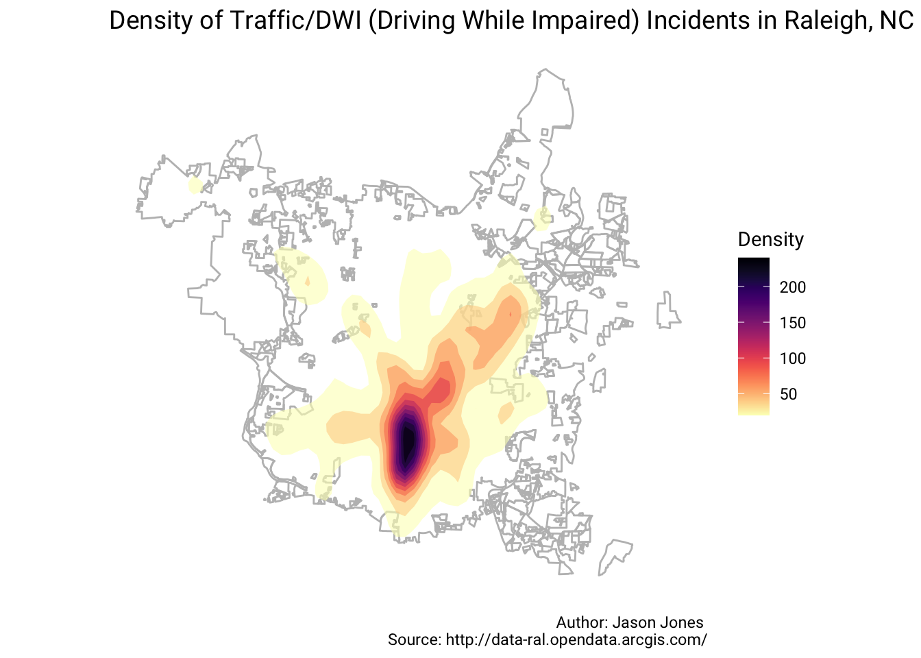
Hexbin Plot
Next is a Hexbin map of Traffic/DWI Incidents.
dat2 %>%
  ggplot() +
  geom_sf(data = raleigh_limits, color = "grey", fill = NA) +
  geom_hex(aes(X,Y), alpha = 0.6) +
  viridis::scale_fill_viridis(option = "magma", direction = -1, name = "Density") +
  labs(title = sprintf("Density of %s Incidents in Raleigh, NC", crime_des),
       caption = "Author: Jason Jones \nSource: http://data-ral.opendata.arcgis.com/") +
  theme(text = element_text(family = "Roboto"),
        plot.title = element_text(size = 14),
        panel.background = element_blank(),
        axis.text = element_blank(),
        axis.title = element_blank(),
        axis.ticks = element_blank(),
        axis.line = element_blank())
Clustering By Police Stations
Finally, is a map of law enforcement stations where the count of clustered incidents is mapped to the size of the point.
dat %>%
  st_coordinates() %>%
  as_tibble() %>%
  mutate(cnt = dat$cnt, AGENCY = dat$AGENCY) %>%
  ggplot() +
  geom_sf(data = raleigh_limits, color = "grey", fill = NA) +
  geom_point(aes(X, Y, size = cnt, color = AGENCY), alpha = 0.8) +
  scale_color_brewer(palette = "Spectral", direction = -1, name = "Agency") +
  scale_size(name = "Count of Incidents") +
  labs(title = sprintf("Clustering of %s Incidents by LE Stations", crime_des),
       caption = "Author: Jason Jones \nSource: http://data-ral.opendata.arcgis.com/") +
  theme(text = element_text(family = "Roboto"),
        plot.title = element_text(size = 14),
        panel.background = element_blank(),
        axis.text = element_blank(),
        axis.title = element_blank(),
        axis.ticks = element_blank(),
        axis.line = element_blank())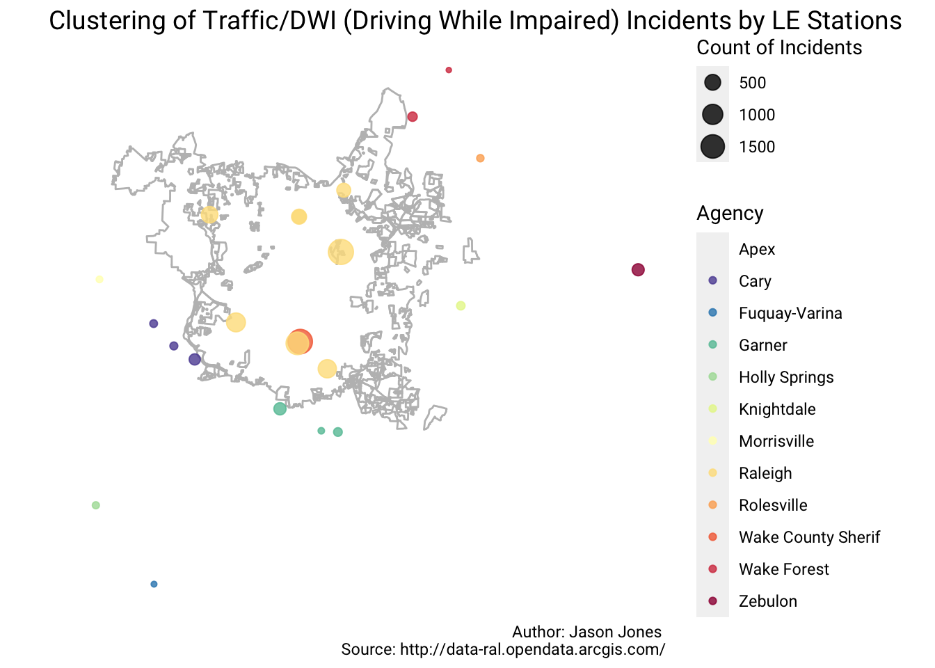
Maybe one more time just for fun!
Define Crime Description Again
crime_des <- "Assault/Simple"Extract Nested Tibble Again
dat <- raleigh_police_nested %>%
  filter(crime_description == crime_des) %>%
  .$closest %>%
  .[[1]] %>%
  st_as_sf()

# Also creating secondary object for density plots
dat2 <- raleigh_police %>%
  filter(crime_description == crime_des) %>%
  st_coordinates() %>%
  as_tibble()
Density Plot Again
dat2 %>%
  ggplot() +
  geom_sf(data = raleigh_limits, color = "grey", fill = NA) +
  stat_density_2d(aes(X, Y, fill = ..level..), geom = "polygon", alpha = 0.6) +
  viridis::scale_fill_viridis(option = "magma", direction = -1, name = "Density") +
  labs(title = sprintf("Density of %s Incidents in Raleigh, NC", crime_des),
       caption = "Author: Jason Jones \nSource: http://data-ral.opendata.arcgis.com/") +
  theme(text = element_text(family = "Roboto"),
        plot.title = element_text(size = 14),
        panel.background = element_blank(),
        axis.text = element_blank(),
        axis.title = element_blank(),
        axis.ticks = element_blank(),
        axis.line = element_blank())
Hexbin Plot Again
dat2 %>%
  ggplot() +
  geom_sf(data = raleigh_limits, color = "grey", fill = NA) +
  geom_hex(aes(X,Y), alpha = 0.6) +
  viridis::scale_fill_viridis(option = "magma", direction = -1, name = "Density") +
  labs(title = sprintf("Density of %s Incidents in Raleigh, NC", crime_des),
       caption = "Author: Jason Jones \nSource: http://data-ral.opendata.arcgis.com/") +
  theme(text = element_text(family = "Roboto"),
        plot.title = element_text(size = 14),
        panel.background = element_blank(),
        axis.text = element_blank(),
        axis.title = element_blank(),
        axis.ticks = element_blank(),
        axis.line = element_blank())
Clustering By Police Stations Again
dat %>%
  st_coordinates() %>%
  as_tibble() %>%
  mutate(cnt = dat$cnt, AGENCY = dat$AGENCY) %>%
  ggplot() +
  geom_sf(data = raleigh_limits, color = "grey", fill = NA) +
  geom_point(aes(X, Y, size = cnt, color = AGENCY), alpha = 0.8) +
  scale_color_brewer(palette = "Spectral", direction = -1, name = "Agency") +
  scale_size(name = "Count of Incidents") +
  labs(title = sprintf("Clustering of %s Incidents by LE Stations", crime_des),
       caption = "Author: Jason Jones \nSource: http://data-ral.opendata.arcgis.com/") +
  theme(text = element_text(family = "Roboto"),
        plot.title = element_text(size = 14),
        panel.background = element_blank(),
        axis.text = element_blank(),
        axis.title = element_blank(),
        axis.ticks = element_blank(),
        axis.line = element_blank())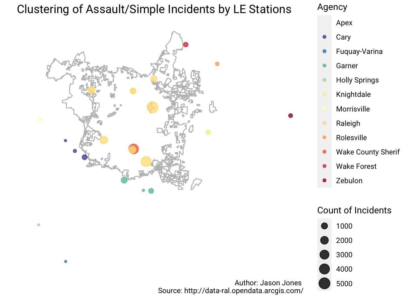
I really appreciate the class taught by James Cheshire even though this is a little bit of a deviation from clustering to roads. I am thinking something like this could be suited for a shiny application. Not sure if I will ever get around to making that happen.
Tags:
comments powered by Disqus